This Was Our Pact
One of the things about going on an adventure—a hike, a climb, a road trip, a sail—is that you never know how it's going to turn out. I mean, obviously. But that obvious thing is a big part of it. Sometimes, you'll get through to the other side and look back in disappointment, few of your goals or hopes for the trip met. Maybe your car broke down (been there), maybe it rained so thoroughly across your trip that none of the paths were safe or available (been there), and maybe bears stole all your food when you were two days out from the trailhead (been there). Maybe the friends you went with turned out to be not the friends you'd hoped they were.
But then maybe you emerge from the wild exhilarated. Maybe this trip so far exceeded your hopes that you can't imagine anything better. Maybe for years you remember that adventure and the amazing things you saw and did, how everything just worked together just right (even the trials) so that now, a decade later you still tell people about it. And then, because that hike or climb or whatever was so great, you try to relive it. You plan the same route. You recreate all the conditions so far as you are able, and you bring your friends and family along. You've got something amazing to share after all and it would be selfish to keep it to yourself.
Only, things are different. Again, obviously. The landmarks are the same, though changed slightly. Maybe something was tougher—or easier—than you remember. Maybe the food is a little different, the leaves altered, the season cooler. None of it is bad. The flora is impressive, the air crisp, the night skies jolting, the vistas spectacular. By any measure, you've experienced something amazing. But it's not the same.
And at this point, you get to decide: will your experience be governed by what you loved or by what you love?
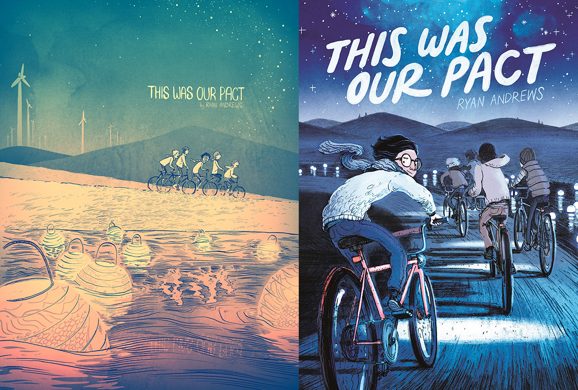
I first encountered the 80-page webcomic version of Ryan Andrews' This Was Our Pact around seven years ago. Or so. The timeline's fuzzy, but I remember a co-worker leaning over his shoulder and saying, "Hey, have you seen that comic with the fisherbear yet?" It was of course An Experience—and one that stayed with me. When Andrews announced in 2013 that the book would be released on paper from First Second, I was jazzed. I've never been comfortable reading comics through a screen, so being able to keep this on my shelf was going to be a huge blessing.
Only, it was different.
Six years later when the book arrived at my door, it felt different. Flipping through, it was obviously This Was Our Pact but it was changed. I looked back at a few images that survived online from the original and it became immediately clear why the book took so long to make the transition from webcomic to hardback. For one, the book was entirely redrawn. For another, Andrews transitioned the story from a simple greyscale palette to full-and-rich colour. And, most prominently, he added 250 pages of new story. No longer lean and spare, with a singular whimsical purpose, This Was Our Pact was now thick with wonder.
And so I had an opportunity before me. This was me going on that old adventure again, the one I remembered so fondly. Only, would I be able to see past my nostalgia, beyond my expectations? Or would I get caught up by the differences, would my love for a perfect story become an obstacle to this expanded retelling of that same story? And because I'm human the answer was always ever going to be neither and both, waffling back and forth from one minute to another. There is no objective approach to literature. We are formed by our history, environment, biases, loves, and expectations. So rather than talk about which one I think is better, let's look at how two very different instances of the same story can both bear marks of excellence unique to their tellings.
Art
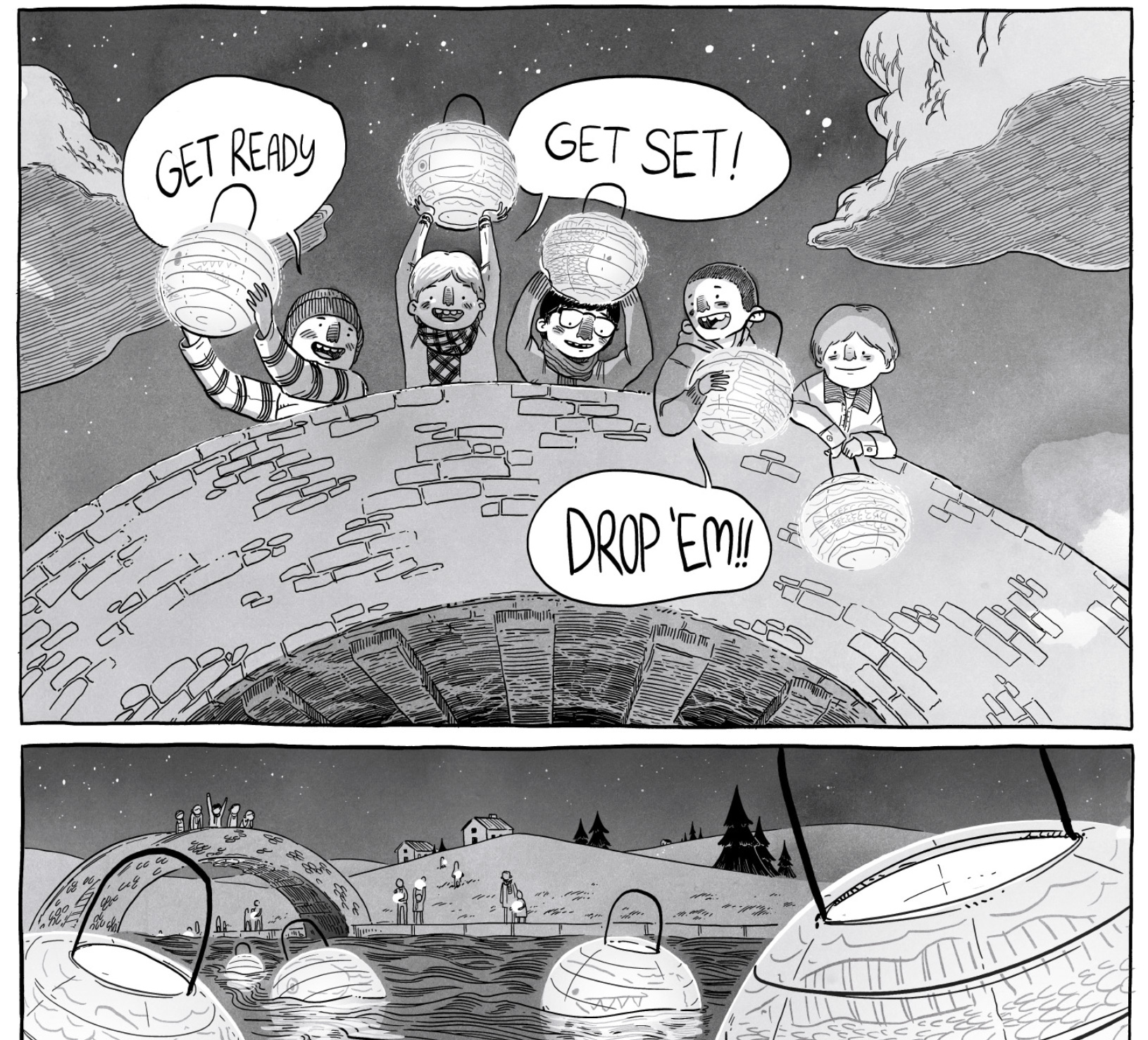
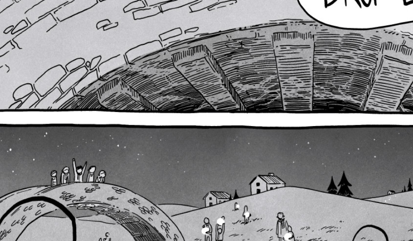
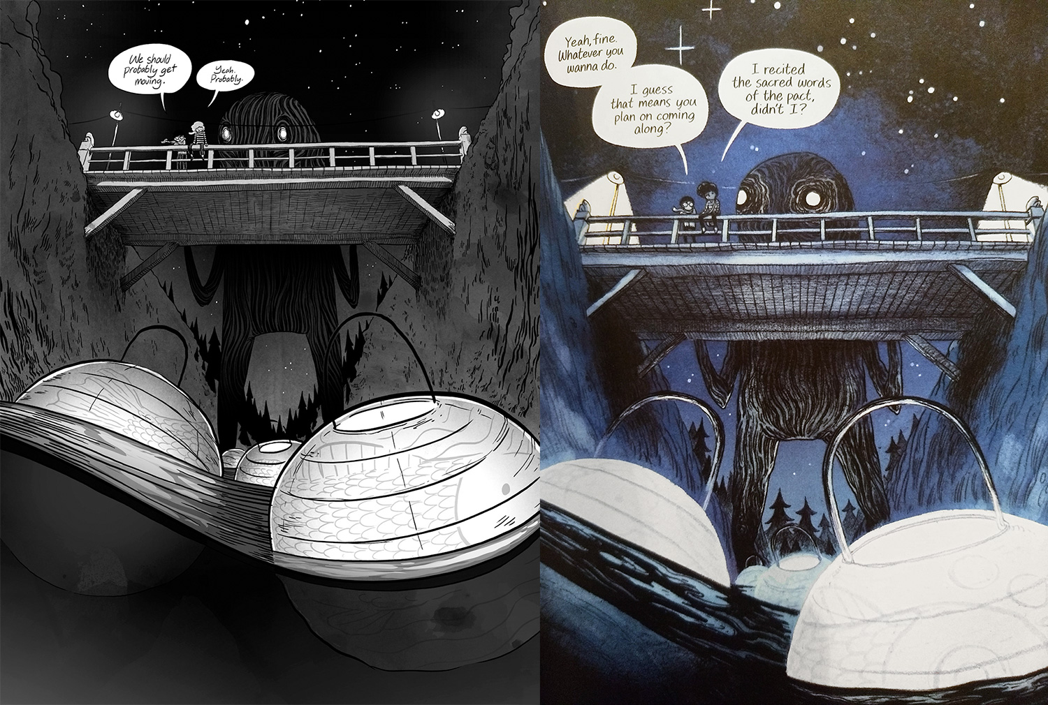
In the original, the art is crisp. Crisp enough to have been drawn with a stylus on a Cintiq or such. There is a lot of sharp detail to the linework. I love the aesthetic. Check out the detail on the underside of this bridge:
And how Andrews emulates the reflection of the river below:
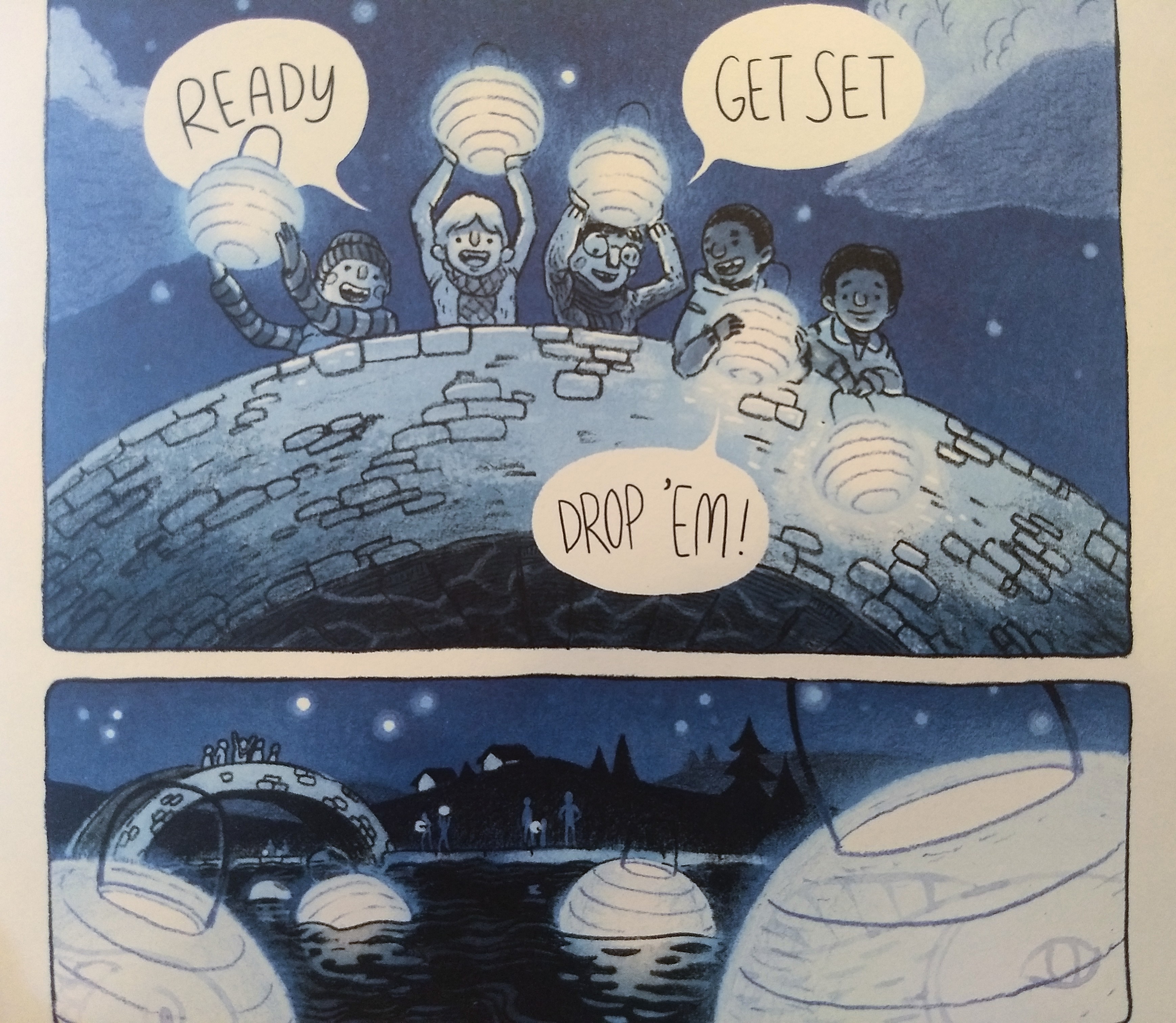
Here's the same scene, in the colour edition:
I don't want to say Andrews sacrifices that detail in the new edition, because terms like sacrifice and loss prioritize the value of one artistic choice over the other, and I don't think that's an adequate way to describe what is probably better understood merely as difference. In any case, the new edition uses digital colours over pencils. The pencils create a lot of variation in texture all on their own, and adding the digital brushes for colour makes the 2019 edition a visually softer story (which nicely dampens some of the harder edges introduced storywise).
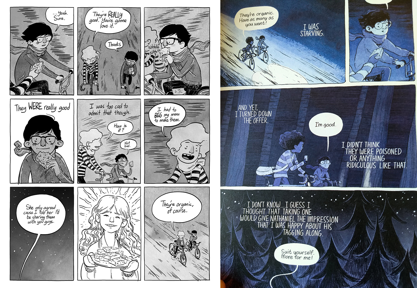
For the original edition, Andrews uses watercolour washes to add texture (anyone who's seen my own work knows that I enjoy this technique myself). The use of greyscale allows Andrews to focus the reader through tonal cues, drawing the eye to places that might other be lost in the scenery or action.
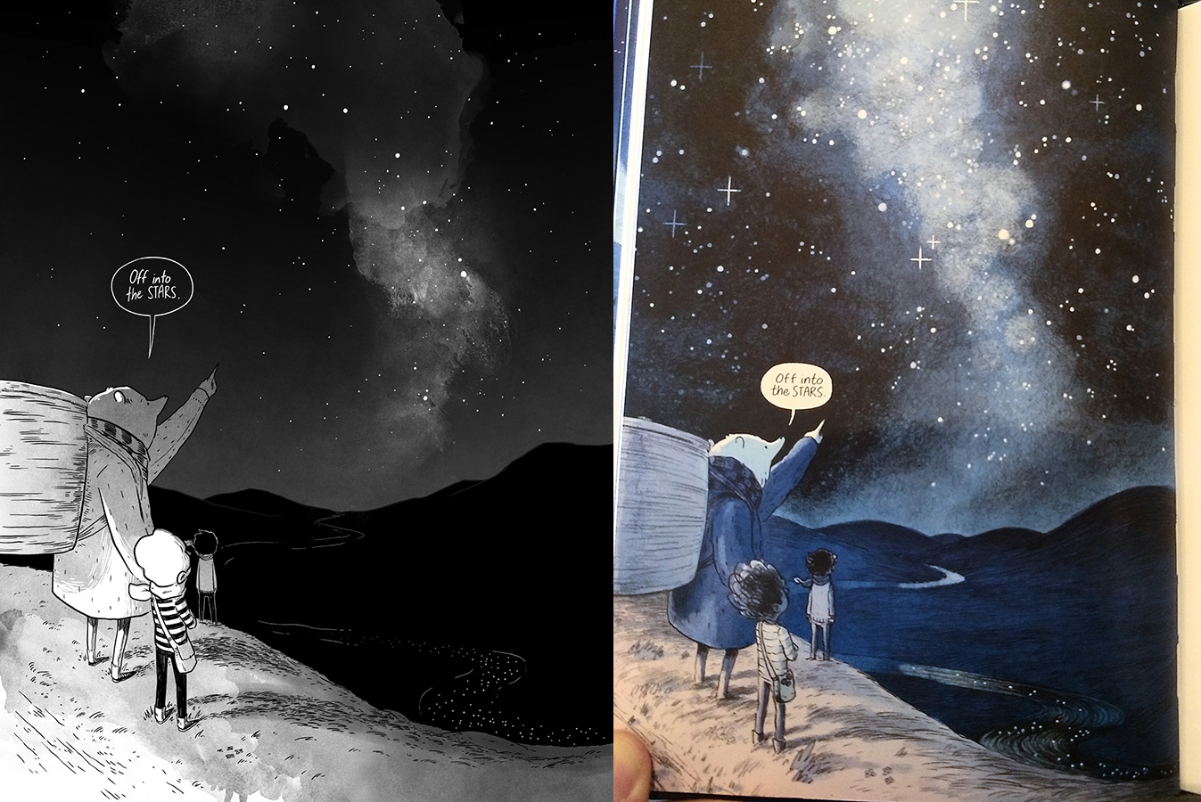
As an example, look at this delightful page:
These pages each hint at the legend/myth/folk tale of the riverful of lantern/fish swimming into the heavens to become stars. This is not an event anyone in the story has actually witnessed, so Andrews uses an inverted bit of watercolour in the black-and-white edition to hint at the possibility. Visually, it's very strong.
In the colour edition, it's a softer piece. The evocation of a river lantern/fish into the sky is hazier, removed further into the realm of interpretation.
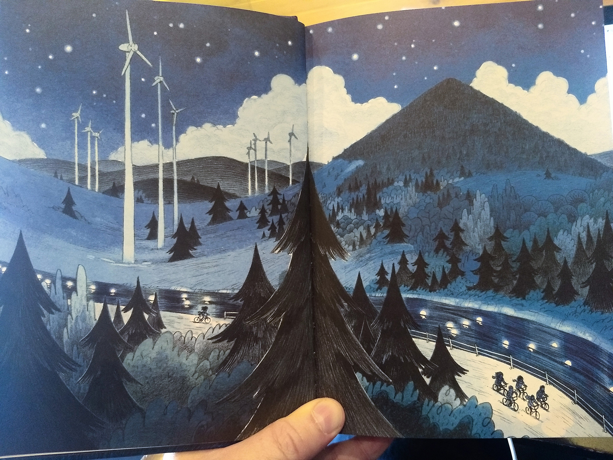
Sometimes though, the colour edition highlights things less visible in the original. In this two-page spread, the lanterns in the river positively glow. They are a focal point of the spread:
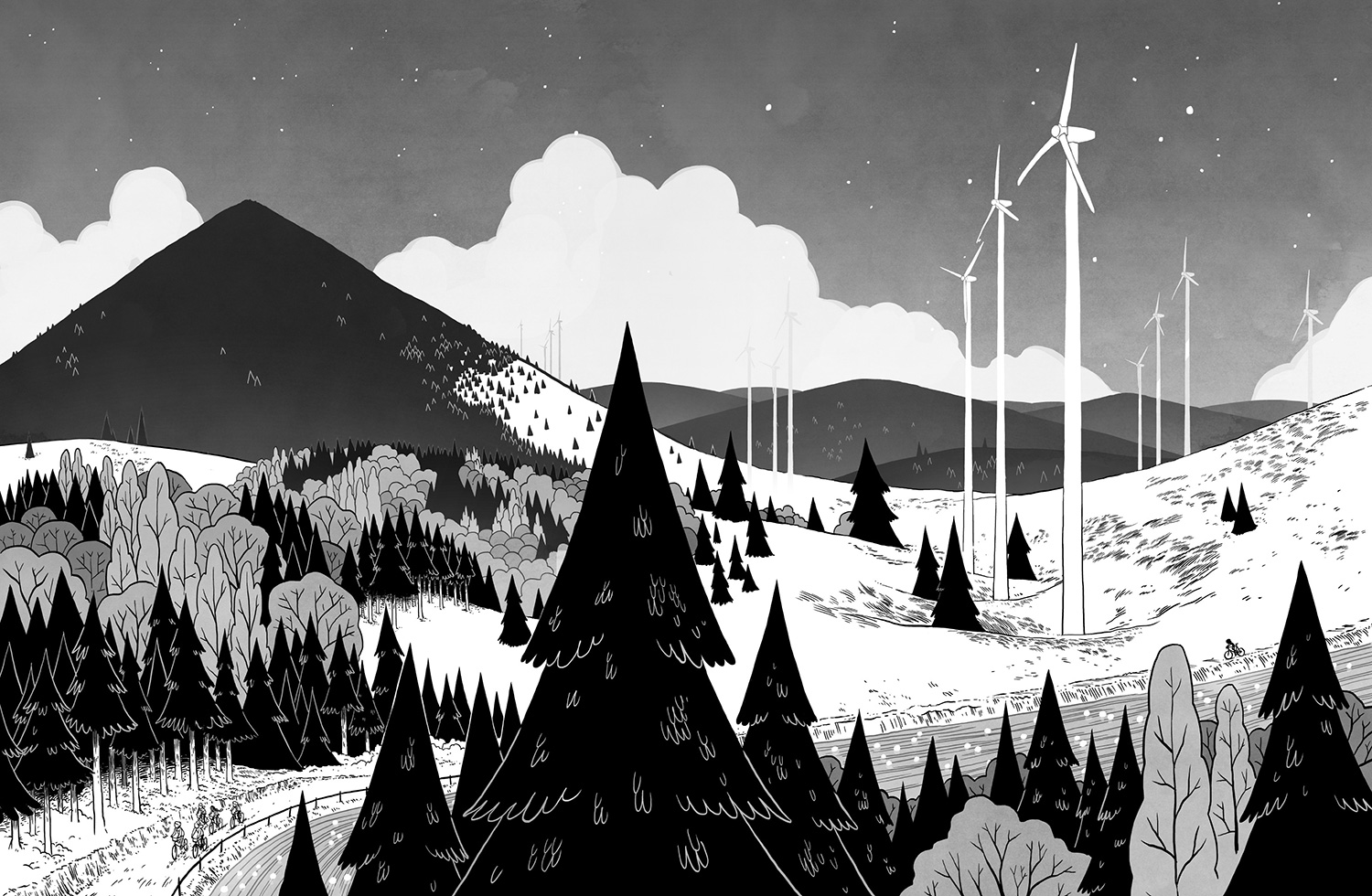
In the black-and-white edition, being the same tonal value as the spread of land next to the river, they are almost entirely swallowed up, only noticeable as one dwells on the page.
In the colour version, they appear to be a large purpose of the page. We are following the kids who are following the lanterns. In the black-and-white version, we are following the kids who are traversing this great swath of landscape. Different art, different narrative emphasis.
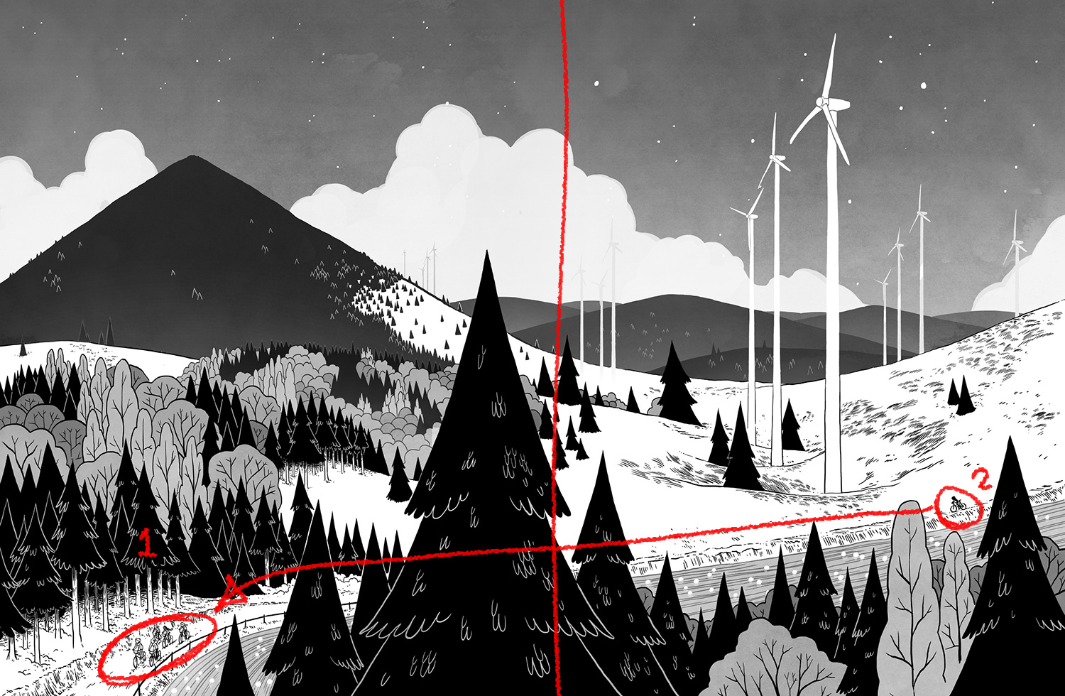
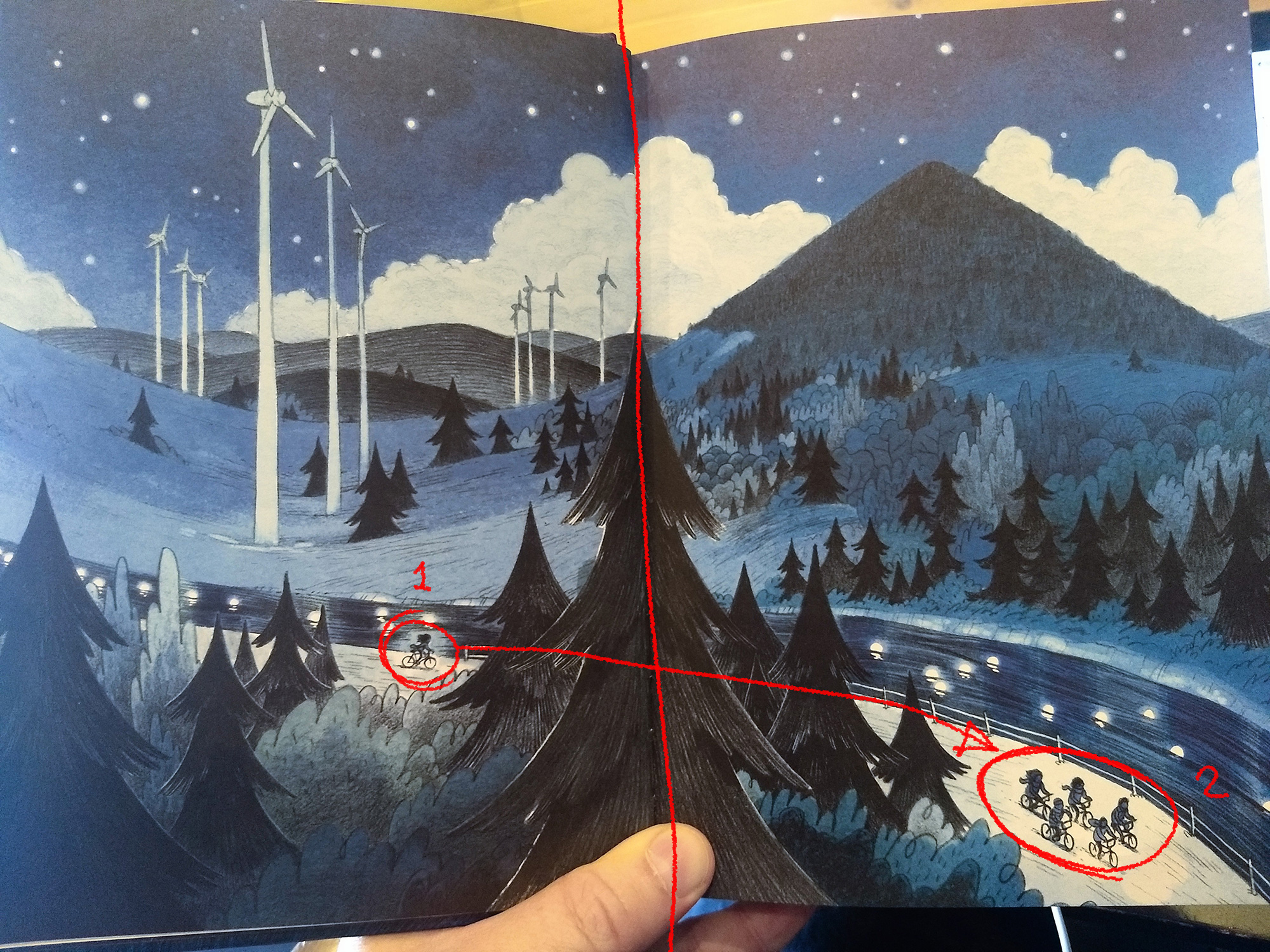
In an interesting change, the flow of action reverses. In the original, the kids ride from right-to-left across the spread. We visually first notice pack and then move to the second page where we notice Nathaniel, trailing far behind.
In the 2019 edition, we first notice Nathaniel, alone, then move to the next page where we see the pack. The decision alters the storytelling slightly, putting weight and priority on Nathaniel earlier than in the original version. This may have been an incidental shift though. Generally in comics storytelling, we see the flow of action carry the reader in the direction of reading—so in the West, from left to right. In the original, Andrews took us against that flow.
Additionally, in both editions, the panel previous has the kids riding from left to right across the page. The black-and-white version then reverses the direction, telling the reader that the path is twisting, unruly. In the colour version, it tells the reader that the path is moving in a normal, easy-going manner, no surprises here. Both directions are viable as the black-and-white primes the reader for the Big Surprises down the path, while the colour leaves those surprises to be all the more surprising while also underscoring the fact that the pact is abandoned by the pack before any of the daunting surprises arise.
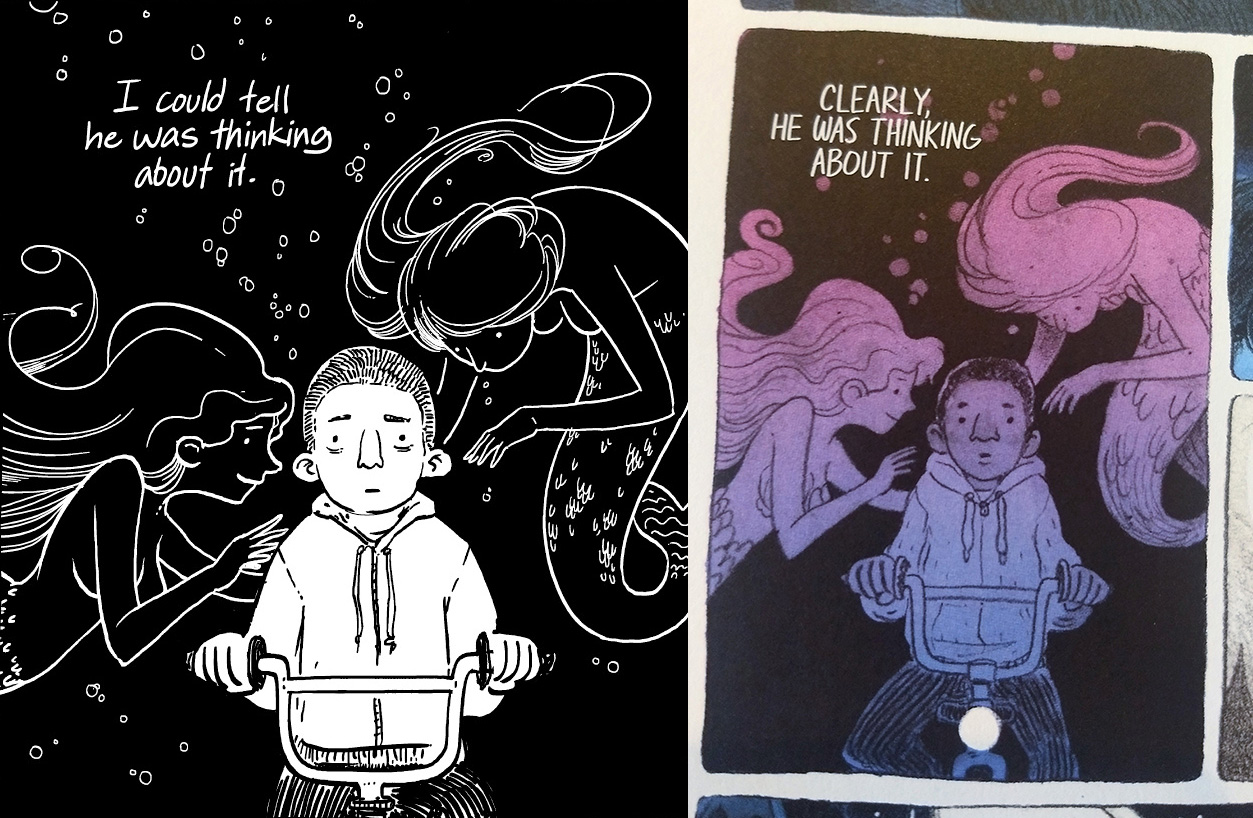
One last thing about the art proper, strictly because it amused me. In the coloured edition, the mermaids wear shell bras, whereas they wore nothing (though Andrews still demurred on nudity shown).
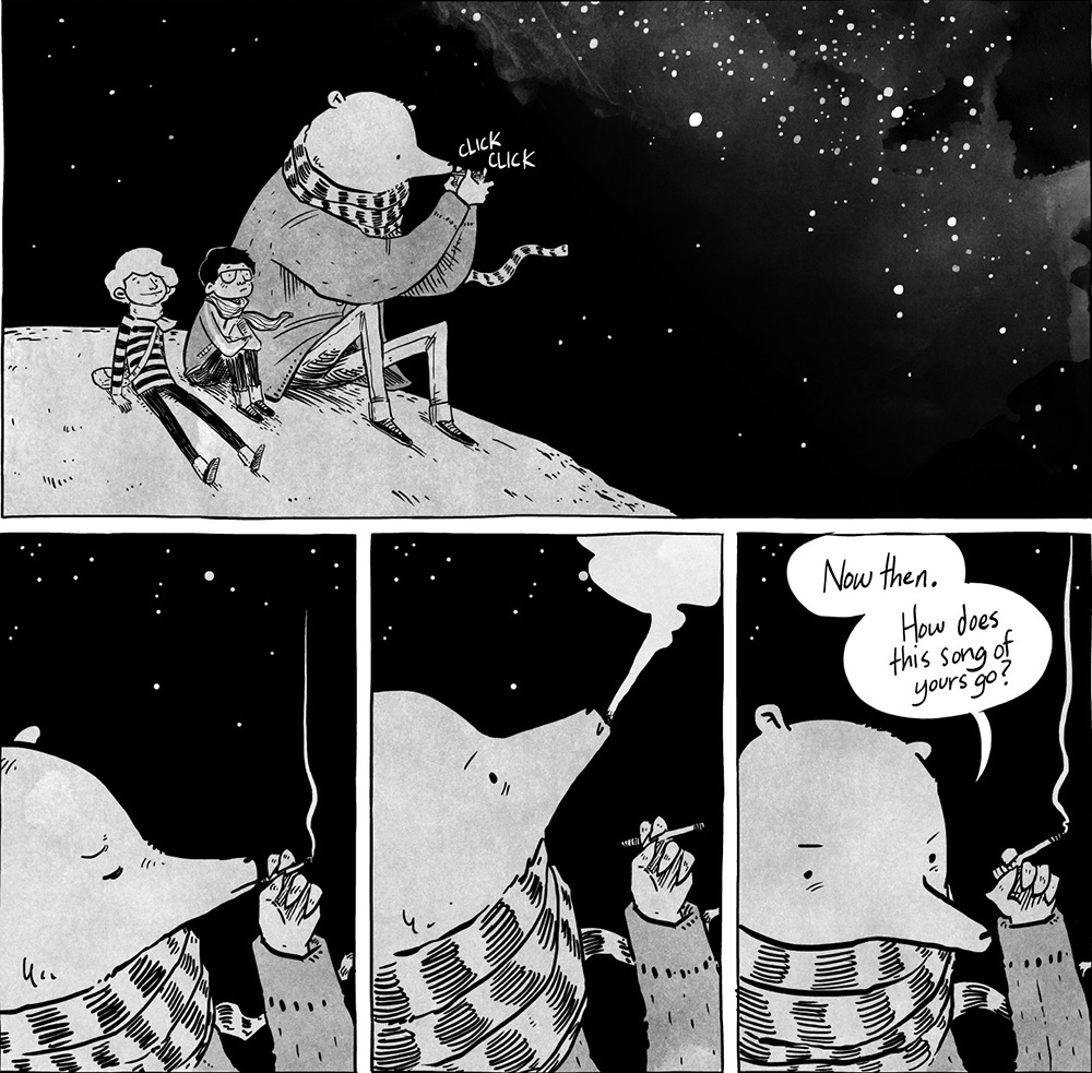
I'm guessing this was a minor addition suggested by editorial to keep the book marketable to middle grade readers (there were similar changes made to The Hunting Accident between its Kickstarter release and First Second edition). I imagine that for the same reason, the bear no longer smokes. Not a big deal, just amusing.
Story
Though the visual distinction between editions is the first thing readers will notice, the difference between narratives is perhaps of a wilder kind. After all, it's probably going to be a rare story that can remain itself the same after inserting a section as large as four times itself. And would we even want that? After all, a story that can remain unscathed after removing 80% of its mass is a good argument for removing that 80%. Conversely, a story that remains the same after growing by 400% is a good argument for not growing it so large.
In any case, yes, This Was Our Pact 2019 holds quite a bit different a story than the original. And not all of that is due to the interior episodes that lengthen the journey. Characterization has shifted as well, particularly on the part of the main character. In the original, Ben is determined if a little cowardly, but the story is less about him and more about this fantastic night. In the new edition Ben is both of those things, but since the new story is concerned with the journey and what that overt gepgraphical journey means for the interior journey of Ben, he is also callow, a bit vindictive, and kind of a grumpy little butt at first. Think of a low-key Harry-Potter-Book-5 Harry Potter. Not as awful as Book 5 Harry, of course, but not great either. Still, he doesn't stay that way because as with all soul's journeys, there is an arc.
I will be honest that I was less interested in this version of Ben. This is a very personal preference, but one of my least favourite character types since elementary school has been the Petulant Child Hero. They agitate me for whatever reason. But despite that, the wonder of the book won me over, and I was able to travel the journey of growth along with Ben without ever feeling too put out.
And where the original story is about One Amazing Night and gets you into it and out of it on a breeze, leaving you feeling refreshed and jubilant, the new edition is set up more like a sort of Voyage Of The Dawn Treader, where Ben and Nathaniel make a lot of stops along the way to the original story's climax. They aren't exactly hopping island to island, but there is a bit of that flavour. Lots of detours where they learn to rely on each other, air some grievances, encounter various dangers and snares, and grow a little more comfortable in their own skins. It's set up, very sensibly, like a road-trip movie, and any departure from the road *must* return to the road.
While I think I ultimately prefer the punch and magic of the original, the new story format introduces several scenes that are now so ingrained in my perception of the story that I can't believe they weren't part of the original. Particularly breathtaking is the scene where Ben and Nathaniel, children both of astronomers point out the constellations only to have a new friend of a different culture point out his own very different constellations using the same set of stars. That was such a wonderful moment, and I'm grateful to have seen it and have been able to point it out to my children as they read the book.
Lettering
Having these two editions side by side is a great way to compare just how much lettering can add to a comic. Andrews, in his original, goes wild with his lettering, employing a style we commonly find both in indie works and in a lot of books from Europe. It's an organic style that Andrews adapts to the art in the panel (or perhaps adapts the art to the letters), adding text into negative space here and there, following the line of landscape as often as not. I'll be plain: I love it.
Though it's missing from the newer edition, I can't really count it as a missed opportunity because the crisp black-and-white style of the original allowed for that kind of lettering whereas the coloured version does not.
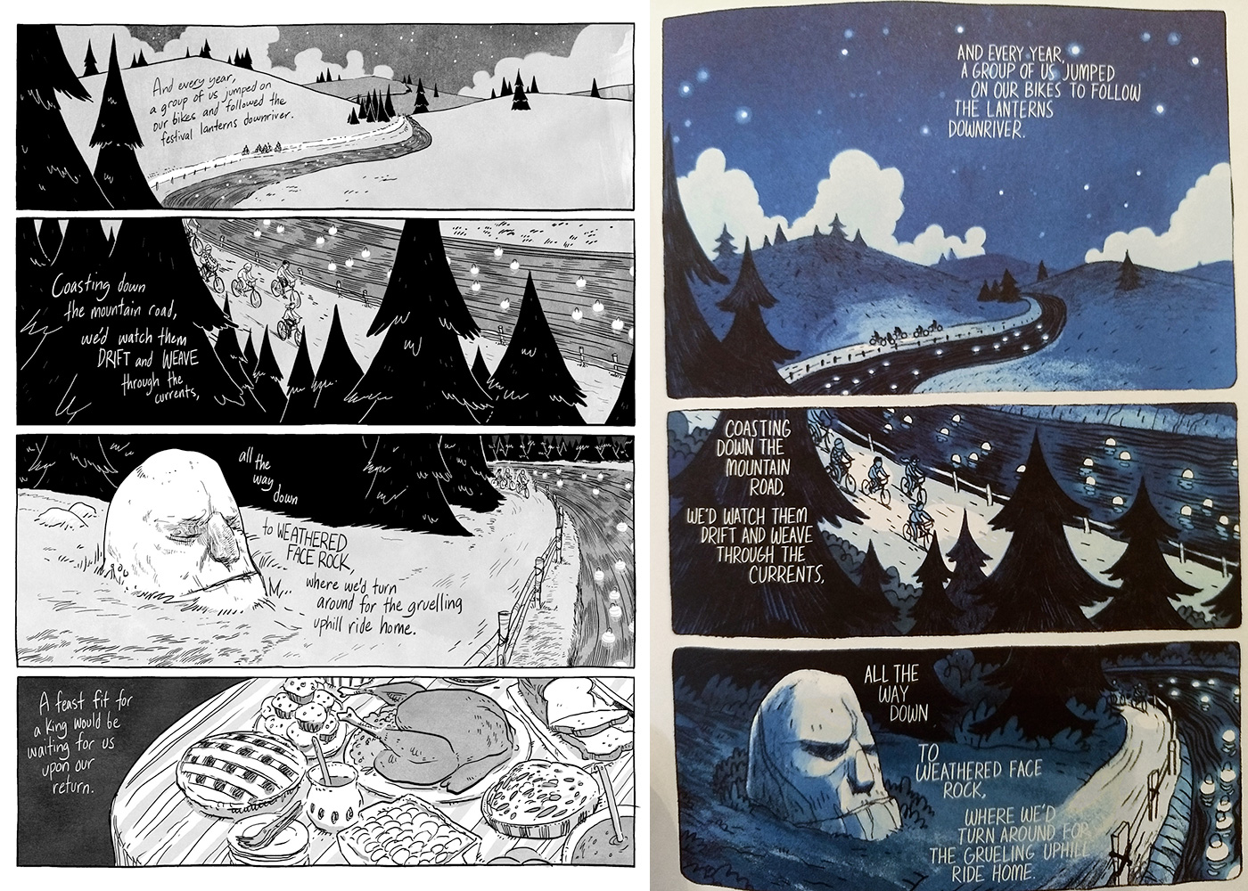
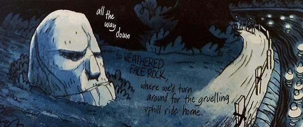
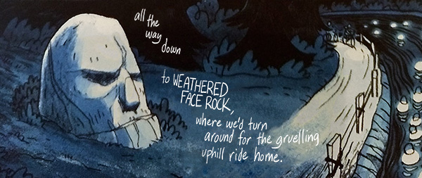
Compare this page where the kids ride by weathered face rock. In the original edition, the stark tonal values allows maximum legibility for text, but with the beautiful soft colour variegation in the 2019 edition, such text would be prone to getting lost.
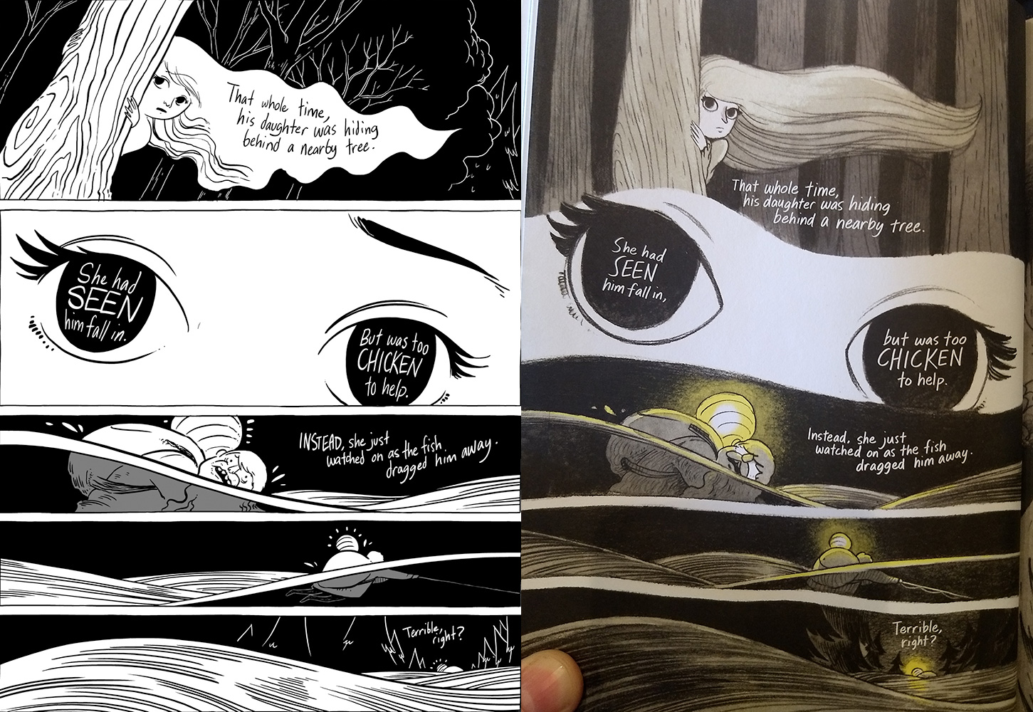
So Andrews employs a more conservative set of techniques. He still gets some of that flavour in here and there, such as in the girl's eyes here:
But on the whole practicality trumps artistry due to the nature of the edition.
Conclusion
This was a great experience, being able to take others on the adventure that I was able to enjoy so many years ago. Friends. My children. Hopefully a ton of others who read my recommendations. This Was Our Pact, in any form, is a great experience. Hopefully through my recounting of some of the differences, you'll have been able to pick up on how much I value this book.
By the way, my 7-year-old son wants you all to know that this is his favourite part of the book, where the creature from Nothing Is Forgotten observes our heroes unnoticed.
Good Ok Bad features reviews of comics, graphic novels, manga, et cetera using a rare and auspicious three-star rating system. Point systems are notoriously fiddly, so here it's been pared down to three simple possibilities:
3 Stars = Good
2 Stars = Ok
1 Star = Bad
I am Seth T. Hahne and these are my reviews.
Browse Reviews By
Other Features
- Best Books of the Year:
- Top 50 of 2024
- Top 50 of 2023
- Top 100 of 2020-22
- Top 75 of 2019
- Top 50 of 2018
- Top 75 of 2017
- Top 75 of 2016
- Top 75 of 2015
- Top 75 of 2014
- Top 35 of 2013
- Top 25 of 2012
- Top 10 of 2011
- Popular Sections:
- All-Time Top 500
- All the Boardgames I've Played
- All the Anime Series I've Seen
- All the Animated Films I've Seen
- Top 75 by Female Creators
- Kids Recommendations
- What I Read: A Reading Log
- Other Features:
- Bookclub Study Guides

