Talking to Strangers
Created by: Fehed Said, Faye Yong, and Nana Li
Published by: PUBLISHER
ISBN: 1905038267 Amazon
Pages: 224


In reading Fehed Said's collection of short stories, Talking to Strangers, I again encountered the problem I've previously related in reviewing Kazuo Ishiguro's collection of shorts, Nocturnes, and the same one I ran across in Kevin Huizenga's fantastic album of shorts, Curses. Most anthologies are made uneven in tone and quality by their disparate parts. I've read perhaps only a single collection of stories in which every story was at least very good. All others tend to suffer somewhat for their variety.
Fortunately Talking to Strangers, like both Ishiguro's and Huizenga's collections, acquits itself well despite a few missteps.
The book's strength somewhat lies in its varied nature. Each story is unique in the kind of story it tells as well as the style with which it is executed. Where one story is chilling, another might be celebratory. Where one functions as fable, another runs toward parable. The author shows range and invention and, with one exception, the collection is an easy and fun read, by turns thrilling and sweet and tragic.
Said is joined by a number of collaborators who contribute the art for the volume. While I definitely missed Shari Chankhamma (Said's previous collaborator on The Clarence Principle) and her gorgeous work, the artists in this volume generally don't harm the work. Some actually work spectacularly well with Said's scripting and even elevate the work. In particular, Faye Yong's work on the fifth story in the anthology is an absolute joy and reason enough to give the book a read. There are some hiccoughs though and this is perhaps the principal area in which the book could have been better.
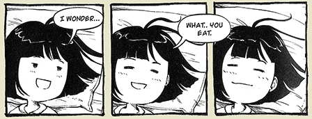
Here's a breakdown of the stories in order of preference (slightly spoilery when referring to "Static" and "Box"):
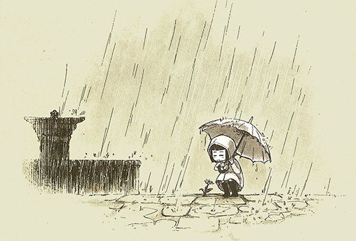
"Flowers" was definitely my favourite of the series. There are so many good things about this story and its artistic realization that I have to say I liked it better than I did The Clarence Principle, which I'm on record as enjoying pretty thoroughly. Faye Yong's crisp, whimsical art here matches perfectly with the style of story Said has scripted. And the story conceit of a world in which flowers are a thing of the past is wonderful. Elowena's moment of discovery in the story reminded me of my own encounter with a blooming flower while sneaking through Arlington Cemetery in Fallout 3. I could absolutely feel and relate to her sense of wonder. As well, Yong's constant inclusion of background detail (i.e., mise-en-sc�ne) gives the story a vibrancy and immediacy that's missing in some of the other stories. Said's inclusion of minor, superfluous details adds to the overall sense that these are people we can relate to and care about (e.g., moments like, "Can I have my earmuffs back now?" "No."). This was, for me, an essentially perfect story.
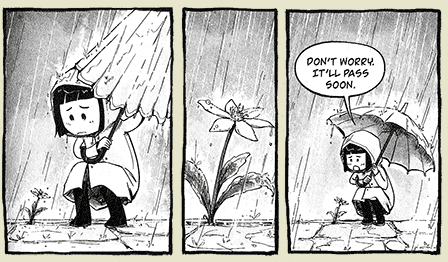 Faye Yong's art for "Flowers"
"Static" comes in second—another story I loved. I'm not sure how the art chores are broken up on the story (it lists both Wing Yun Man and Faye Yong as contributers here) but despite my early hesitation to get behind the art (it felt like kind of a rough cut of Bryan Lee O'Malley's work in the initial pages), the drawings grew on me and won me over by stoy's end. Like "Flowers," this story has little touches that bring it to life for me (e.g., the Can Dent Notifications we get). As well, the fact that it's static that brings Mr. Jessop out of stasis is a worthy idea and I enjoyed how it came about. (It helps that I'm a sucker for a sweet romance—so my personal biases may be working overtime in favour of this story. Hard to say.) An awesome little story that put a smile on my face.
"Box" was neat, tidy, and interesting. It followed in the tradition of the short stories that Alfred Hitchcock Presents or The Twilight Zone adapted into their brand of twisted television shorts, taking genre presumptions and torquing them into surprising new frameworks and thereby reconditioning reader response. "Box" was powerful in its way, prompting the reader to wonder at the experience of those on life support. Whether there is some level of consciousness currently undetectable by our current medical progress or not, the story certainly offers food for thought. As the first story presented it was a powerful beginning to the collection and, though not my favourite, still resonated on a gut level. The art was mostly competent and served the story. Still, though I realize it seems to be Nana Li's style, the eyelashes that are fuller and bushier than eyebrows did tend to occasionally take me out of the story so I could think, Man, those are weird. Probably if I'd read her work before I wouldn't have been so struck by the idiosyncracy. As a plus for the art, the moment when Nikola is free-floating in darkness and bubbles was pitch-perfect. Her box is gone and she's freed from her confinement by being more insidiously confined. Chill-inducing stuff.
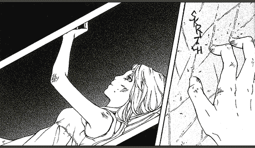 Nana Li's art for "Box"
"The Old Man" comes in at the end as some bonus material, a piece completed in just a week for a competition. It's rushed and it shows, but bonus material rarely exhibits the polish of finished material, so it's hard to judge it on that kind of criteria. The story was a nice reminder to seek a sense of empathy with all peoples and to face the world that's wide-open armed with the wisdom of those who have travelled these paths before us. It was brief (according to competition rules apparently) and I didn't find I was given time to invest myself in the character. Due probably to the rushed nature of the product, "The Old Man" is missing Yong's visual dynamism that illuminated "Flowers." A stronger design sense might have brought to life the story and characters in a way that I didn't experience in its current form. Still, it's bonus material and so it's hard to complain.
"Malignant" is the kind of story that took me a couple reads to glom onto. At this point, I do like it and I enjoy the fact that there is a lot of interpretive room left for reader interaction. The story raises many questions and though its mood was heavy, I enjoyed it for leaving the reader some sense of mystery. Chloe Citrine's art told the story acceptably, but wasn't anything I'd like to revisit. Her figures are stiff and, well, clumsy. Her design sense is strong but her illustrations lack any of that spirit that would make her designs spring to life. With more practice and especially a focus on life (and lively) drawing, she could see much improvement.
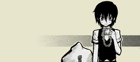 Citrine's art from "Malignant"
"Hero" was, I'm sorry to say, a pretty thorough disappointment to me. The art was a real distraction from the story. As stiff as Citrine's art for "Malignant" was, Sonia Leong's work here was worse. Apart from the stiffness of her figurework, the style employed was ragged (and not in a way that heightens the storytelling), its roughness often making it difficult to see exactly what was going on in a given panel. Visually, I liked nothing about this story (save perhaps for the revelation of beauty in the face of the hooded man, which while still awkwardly done did adequately convey the sense of wonder filling the kid's experience). Storytelling-wise, I think this was Said's weakest effort in the book as well. (Apparently, this was also the oldest, most primitive of the included stories and the production of it proved somewhat frustrating). I didn't find the story's execution invested me in the characters and I never found myself satisfied with the character motivations that drive us to the climactic scene. I'd say a few more pages or a more leisurely pace might have helped, but I wouldn't want to be subjected to more of Leong's art. (I don't get it, really, because from what I've seen via a quick Googling, she's apparently far more competent than she appears in this story. I mean, look at this: I would totally read a story with art like this! Maybe she was rushed, I don't know. Even her work previewed in the back of the book for Romeo and Juliet looks much better. It may be just that she's improved with age?)
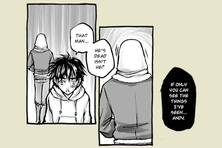 Sonia Leong's art from "Hero"
Overall, the inclusion of a few mediocre efforts does little damage to the overall desirability of the collection. The better stories (which are fantastic) serve to elevate the work as a whole. While excluding the other stories and leaving only "Flower" and "Static" may have been a possible direction for publication, including Said's lesser works as well makes for an interesting retrospective of five or so years of work. The only thing I wish that had been included would be some supplemental material by Said and his artists discussing the work, where they were at, and what they think now. (I'm nearly as much a sucker for behind the scenes stories as I am for sweet romances.)
Good Ok Bad features reviews of comics, graphic novels, manga, et cetera using a rare and auspicious three-star rating system. Point systems are notoriously fiddly, so here it's been pared down to three simple possibilities:
3 Stars = Good
2 Stars = Ok
1 Star = Bad
I am Seth T. Hahne and these are my reviews.
Browse Reviews By
Other Features
- Best Books of the Year:
- Top 50 of 2024
- Top 50 of 2023
- Top 100 of 2020-22
- Top 75 of 2019
- Top 50 of 2018
- Top 75 of 2017
- Top 75 of 2016
- Top 75 of 2015
- Top 75 of 2014
- Top 35 of 2013
- Top 25 of 2012
- Top 10 of 2011
- Popular Sections:
- All-Time Top 500
- All the Boardgames I've Played
- All the Anime Series I've Seen
- All the Animated Films I've Seen
- Top 75 by Female Creators
- Kids Recommendations
- What I Read: A Reading Log
- Other Features:
- Bookclub Study Guides


