Pride & Prejudice
Of Jane Austen's works, perhaps the most difficult to satisfyingly adapt is Pride & Prejudice. It's proven itself so through several lackluster film versions (the only one that represents the book well enough is the 1995 BBC adaptation—and that only succeeds because its leisurely five-hour runtime allows it to indulge in more characters and more plot directions). The other viable conversion is the 1940 adaptation—its chief strength lies in its creators' ability to shear from the source novel with liberality. The problem with Pride & Prejudice, it seems, is that Austen crafted a story that is just too complicated, steeped in nuance and characters and pivotal plot moments. When any of these are stripped away, the result is something other than Pride & Prejudice as Austen envisioned it.
And because the original novel is so well-loved, revision becomes blasphemy. Authors seeking to adapt generally either a) fall into the category of fans themselves or b) are at least well-enough aware of Austen's fans that they recognize any cut will be seen as betrayal. Where one of Austen's lesser works—say, Mansfield Park—could be filmed with a certain liberality and only Austen's most ardent admirers would care, Pride & Prejudice is another matter. So you have clipped, confusing products like 2005's Keira Knightley adaptation that rushes to its finish, packing in every plot point possible yet never allowing the viewer a chance to catch up. For a graphic novel version of the book to succeed then, it must either offer a sturdy page-count or be willing to refashion Austen's story to better suit a more diminutive length.
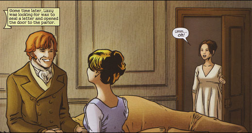 Never more awkward than when you accidentally walk in on the book's one moment free from alternating monologues
Unfortunately for Marvel's edition, writer Nancy Butler proves herself unequal the task of adapting Pride & Prejudice, following after the lack of pruning that made Keira Knightley's version such a wreck. This is no big surprise, really. As mentioned earlier, the book seems ridiculously hard to bring into other mediums. Add to that the fact that Butler is a prose novelist as yet untried as a comics scribe. Predictably, she leans too heavily on her words (or Austen's words if you want to be like that). Panels are filled with walls of text, desperate to get out the requisite information before the book's finale—which comes way too fast. As Butler's version speeds to its conclusion, we have all the dry information we need to ascertain what just happened,* but we haven't been given the room to process it. And more than that, we haven't seen the characters develop in any ways not directly associated with their words.
Which brings us to Hugo Petrus' art.
Even had Butler's writing left plenty of room to make use of the visual storytelling unique to the comics medium, this adaptation would still be roundly considered a failure. The art, apart from being actively bad, is so great a mismatch to the book's content that one wonders how on earth this casting decision was ever made. Petrus' style, even if it was well-done (it wasn't), tries to turn Austen's Eighteen-Aughts romance into a sleek, sexy soap operatic mess. Here, look at the introduction of the Bennet Five:
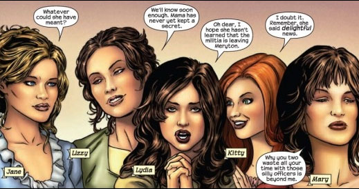 Hi, I'm Larry. These are my sisters Herp and Derp and my other sisters Herp and Derp
Let's forget for a moment that Lizzy looks like she's just polished off a mug of vodka and that Kitty is gazing wild-eyed into the hole in the back of Lydia's head. This looks like the cast of an awful sitcom about five women who co-own a design firm and have wacky, wacky adventures with clients whose requirements they aren't really able to meet but still continue running their business because the show would end otherwise. And apart from their collars, it could probably be set in a period as recent as last year (though one of them would have to have shorter hair, maybe). They're even wearing lipstick and doing the whole pouty-lip/duckface thing.
The real tragedy is that for months before the book came out, Marvel teased Pride & Prejudice covers. These are what we saw before the book came out:
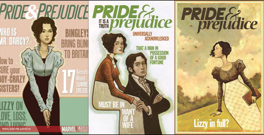 Seriously, aren't Elizabeth and Darcy just TOO adorable here? (click to enbiggen)
They were fantastic-looking. (I mean, apart from the faux-Cosmo text thrown up all over.) The illustrations by Sonny Liew were completely adorable. That was an Elizabeth Bennet that I wanted to read about—even if the writing was only so-so, Liew's art sold me on the series, easy. An artist who could create such a winning Elizabeth and Darcy was easily worth my attention. If you hadn't figured it out already, allow me to point out: Sonny Liew is not Hugo Petrus and Sonny Liew's only contribution to the book is cover art. This is why some readers get upset when the art featured on a book's cover does not at all resemble the art in the book's interior. Even though this is pretty common practice, it stinks of false advertising.
So, Jane Austen gets stuck with Petrus, who (at least in this volume) seems incapable of matching character art with what is going on in the panel. Examples:
The Elizabeth who has shown herself cynical enough to merrily jest about the folly of the class-conspicuous occupants of Netherfield suddenly appears dead inside, reacting to Jane's goodwill toward Bingley by being overwhelmed by the hopelessness of a world that will always beat down truth and beauty in every instance:
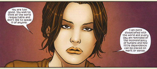 Note: Jane is supposed to be playfully exasperated in this scene
Mister Collins, buffoonish applicant to marital bliss with Miss Elizabeth Bennet, while talking of the girl's possible loss of income, decides to model Blue Steel for Mrs. Bennet:
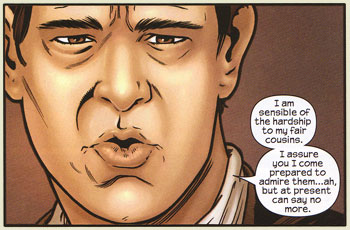 Personally, I prefer to lead with the tongue or teeth, but if lips is what you've got then lips is what you've got.
Mr. Bennet takes off his glasses in time for the aneurism that will absolve him of any personal responsibility in steering his family in a manner that would guarantee Elizabeth's loss of both fortune and the bearing of Darcy's future-babies:
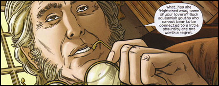 Looks like Mr. Collins will be taking on the house at Meryton sooner than later
Elizabeth, hearing of Mr. Darcy's devotion, happily bites her lip and squeezes out a fart:
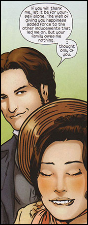 Suddenly Squirtle!
You get the idea. The drawing style strangely shifts throughout, especially in the final chapter. He moves from the crisp (if badly chosen) linework at the book's start to something more thick-lined and chunky resembling Alex Maleev's work in Daredevil. While the later work is generally better, it's still a failure to take the job seriously (if not by Petrus himself, then at the least by his editor).
Marvel fumbled the ball badly with this adaptation. While one might question the purpose of adapting literary fiction to the comics form, I do happen to enjoy a well done transportation of a text from one medium to its new home in another. Pride & Prejudice squanders the goodwill set in place by Sonny Liew's covers and offers nothing of value to the reader. On the off chance that someone will read this adaptation before approaching Austen's novel, it's very possible that they will abandon the novel altogether. And that, of course, is a verifiable shame.
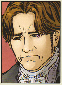 Arf?
Arf?
Note
* Well, we probably have the information we need. As someone who's read Austen's novel four times, it's hard to approach this as someone who doesn't already know what's going to happen. I'm taking it on trust that it's all there and I'm not filling in plot holes with information I learned twenty years ago when I first read Pride & Prejudice.
Good Ok Bad features reviews of comics, graphic novels, manga, et cetera using a rare and auspicious three-star rating system. Point systems are notoriously fiddly, so here it's been pared down to three simple possibilities:
3 Stars = Good
2 Stars = Ok
1 Star = Bad
I am Seth T. Hahne and these are my reviews.
Browse Reviews By
Other Features
- Best Books of the Year:
- Top 50 of 2024
- Top 50 of 2023
- Top 100 of 2020-22
- Top 75 of 2019
- Top 50 of 2018
- Top 75 of 2017
- Top 75 of 2016
- Top 75 of 2015
- Top 75 of 2014
- Top 35 of 2013
- Top 25 of 2012
- Top 10 of 2011
- Popular Sections:
- All-Time Top 500
- All the Boardgames I've Played
- All the Anime Series I've Seen
- All the Animated Films I've Seen
- Top 75 by Female Creators
- Kids Recommendations
- What I Read: A Reading Log
- Other Features:
- Bookclub Study Guides


