

The Road
by Manu Larcenet, adapting Cormac McCarthy
Beautifully drawn postapocalypse that misses much of what makes the novel a superlative piece of literature.


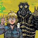
Ducks
by Kate Beaton
Documenting two harrowing years working on the Albertan oil sands for Syncrude and Shell.

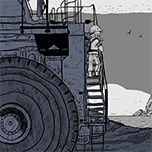
Victory Point
by Owen D. Pomery
A woman wanders an architectural marvel, searching for home, searching for self.
Dorohedoro
by Q Hayashida
The Hole is a crummy place. Mages visit The Hole to experiment with their powers. The Hole is getting mad.

In Waves
by AJ Dungo
AJ Dungo interweaves the history of modern surfing with his own history of loss.
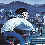
This Was Our Pact
by Ryan Andrews
Two kids follow a road further than anyone’s ever been in a whimsical journey to the stars and beyond.
Top 500 Comics Of All Time
by everyone making comics
My personal choices for best comics, graphic novels, and manga of all time.

Welcome To The Ballroom
by Tomo Takeuchi
A sports manga with a special helping of elegance and fire.


Good Ok Bad features reviews of comics, graphic novels, manga, et cetera using a rare and auspicious three-star rating system. Point systems are notoriously fiddly, so here it's been pared down to three simple possibilities:
3 Stars = Good
2 Stars = Ok
1 Star = Bad
I am Seth T. Hahne and these are my reviews.
Browse Reviews By
Other Features
- Best Books of the Year:
- Top 50 of 2024
- Top 50 of 2023
- Top 100 of 2020-22
- Top 75 of 2019
- Top 50 of 2018
- Top 75 of 2017
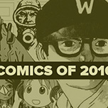
- Top 75 of 2016
- Top 75 of 2015
- Top 75 of 2014
- Top 35 of 2013
- Top 25 of 2012
- Top 10 of 2011
- Popular Sections:
- All-Time Top 500
- All the Boardgames I've Played
- All the Anime Series I've Seen
- All the Animated Films I've Seen
- Top 75 by Female Creators
- Kids Recommendations
- What I Read: A Reading Log
- Other Features:
- Bookclub Study Guides
Connect


Comics by Seth T. Hahne